
Clean vs VS: Which One Looks Better Under Office Lighting and Indoor Conditions?
Clean vs VS: Which One Looks Better Under Office Lighting and Indoor Conditions?
Quick Answer
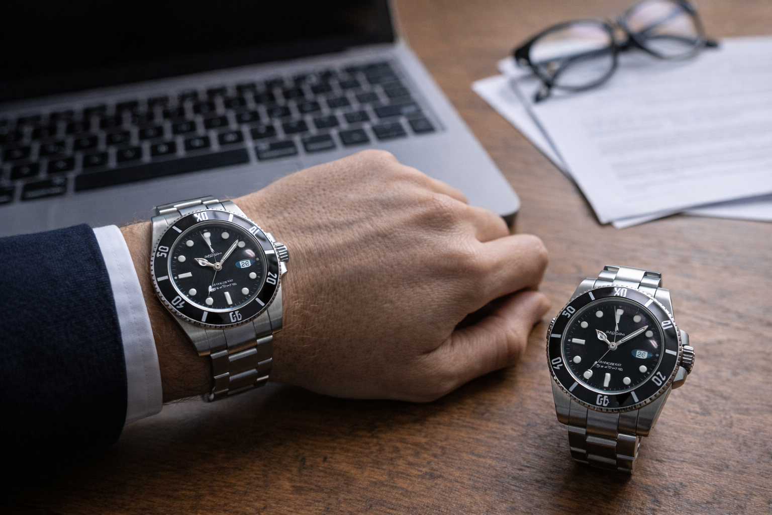
If you are comparing Clean and VS, office lighting and normal indoor conditions often reveal more than bright outdoor photos ever can.
Why? Because most people do not wear their watches under ideal natural light all day. They wear them in offices, meeting rooms, elevators, cafés, cars, and indoor spaces where reflections, dial calmness, crystal behavior, and overall case presence become much easier to judge. In those settings, the watch that looks better is usually the one that feels calmer, more balanced, and more natural at quick glance distance, not just the one that looks sharper in a close-up shot.
Why Indoor Light Is a More Honest Test Than Most Buyers Realize
A lot of buyers compare watches in the wrong environment.
They use:
- outdoor wrist shots
- dealer photos
- edited close-ups
- bright daylight videos
- still images with controlled reflections
Those can help, but they do not reflect how a watch is actually seen most of the time.
For many buyers, daily life happens under indoor light:
- office ceiling lights
- soft daylight from windows
- café lighting
- car interiors
- elevators
- evening restaurant lighting
- computer screen glow and desk lamps
This matters because some watches look strong in clear natural light but become flatter, busier, or slightly harsher in indoor conditions. Others hold together much better.
That is why indoor lighting is such a useful comparison tool. It strips away some of the “photo advantage” and shows whether the watch can still look right when the environment is ordinary.
This also connects closely to Why Some Replica Watches Look Fine in Photos but Less Convincing in Real Life, because indoor conditions are often where that difference starts becoming obvious.
What Buyers Think They Are Comparing — and What They Actually End Up Comparing
Before wearing the watch indoors for a few days, most buyers think they are mainly comparing:
- dial color
- marker sharpness
- bezel appearance
- text detail
- finishing quality
Those things do matter, but in real indoor use, the comparison usually shifts.
What buyers actually end up noticing more is:
- how calm the dial feels under artificial light
- how busy or quiet the crystal reflections are
- how the case catches light at side angles
- whether the watch still feels balanced from desk distance
- whether the watch looks naturally convincing during quick glances
That is a different kind of comparison.
It is less about dramatic detail and more about whether the watch feels visually settled in the kind of lighting you actually live with.
1. Dial Calmness Is One of the Biggest Indoor-Light Differences
This is one of the most important factors.
A watch can look great outdoors because daylight gives the dial more depth, more separation, and more natural contrast. But indoors, that help becomes weaker. The dial has to stand on its own more.
A watch that looks better under office lighting usually has a dial that feels calm. Not dull, but stable. It does not need a perfect angle to feel complete. It still looks composed when you glance at it while typing, walking between rooms, or sitting in a meeting.
A dial that looks less convincing indoors often feels:
- slightly flatter
- more dependent on angle
- a bit too reflective
- less readable at quick glance distance
- visually “busier” than it seemed outdoors
This is why some buyers change their opinion after wearing a watch at work for a few days. The dial may still look technically fine, but it no longer feels as clean or as controlled as it did in better lighting.
If you care about this kind of visual quality, this also links naturally to What Makes a Watch Look Premium in Real Life? 8 Details Most Buyers Notice, because premium feel often depends on calmness, not visual force.
2. Crystal Reflections Matter More Indoors Than Outdoors
Many buyers underestimate this.
In outdoor light, reflections can sometimes make a watch look more dramatic or more expensive. Indoors, reflections are usually less flattering. They can become distracting much faster.
That is why crystal behavior is such an important indoor comparison point.
A watch that looks better under office lighting usually has reflections that feel integrated. The crystal does not constantly fight the dial. The watch remains easy to read, and the overall impression stays smooth.
A watch that looks worse indoors often gives off a slightly different impression:
- reflections feel harsher
- the dial disappears too easily at bad angles
- the crystal draws more attention than it should
- quick time checks feel less smooth
- the watch looks less relaxed at desk distance
This is not the kind of issue most people notice in polished product photos. It is something you notice on a Tuesday afternoon while checking the time between emails.
That is exactly why it matters.
3. Office Lighting Exposes Whether the Watch Feels Too Sharp or Properly Balanced
Some watches look exciting in close-up because the details are bold, reflective, and high-contrast. That can work well in photos. Indoors, it can sometimes become a little too much.
This is where balance becomes more important than sharpness.
A watch that looks better under office light often feels:
- visually controlled
- easy on the eyes
- balanced between dial, bezel, and crystal
- consistent from multiple angles
- more natural in repeated viewing
A watch that feels slightly worse indoors can still look attractive, but it may seem:
- too contrast-heavy
- too reflective
- too dependent on perfect angles
- slightly more aggressive than refined
- less comfortable visually over repeated glances
That distinction matters because office wear is not a one-time visual test. It is dozens of small looks throughout the day.
If the watch feels visually tiring or too angle-dependent, that slowly weakens the whole ownership experience.
4. Desk Distance Is One of the Most Honest Ways to Judge a Watch
This is one of the simplest but most useful tests.
At desk distance, you are not studying the watch. You are not holding it under bright light. You are just seeing it the way you naturally see it during a workday.
That means the watch has to succeed in a subtler way.
A watch that looks strong at desk distance usually:
- reads clearly without effort
- still has presence without shouting
- feels proportional from above
- keeps the dial visually coherent
- does not rely on dramatic reflections to stay interesting
A watch that looks weaker at desk distance often starts losing its structure a little. It may still be good enough, but it no longer feels as complete.
This is one reason office lighting is so valuable as a comparison tool. It removes a lot of the artificial advantage that some watches enjoy in more flattering conditions.
5. Indoor Conditions Reveal Whether the Watch Keeps Its Composure
This is really the bigger point.
A good indoor-light watch keeps its composure.
That means it still looks like itself in:
- office light
- low natural indoor light
- meeting-room light
- elevator mirrors
- car interiors
- late-afternoon desk work
It does not suddenly feel flatter, harsher, or more awkward.
A less convincing one may still look strong occasionally, but it changes more depending on angle and environment. One moment it looks excellent. The next it feels a bit less right.
That inconsistency matters more than most buyers expect.
Because a watch that only looks good in good light is much less useful than a watch that stays visually convincing in ordinary light.
This also ties in with VS vs APS: Which Factory Feels More Refined When You Actually Wear It?, because refinement often becomes much easier to notice indoors than outdoors.
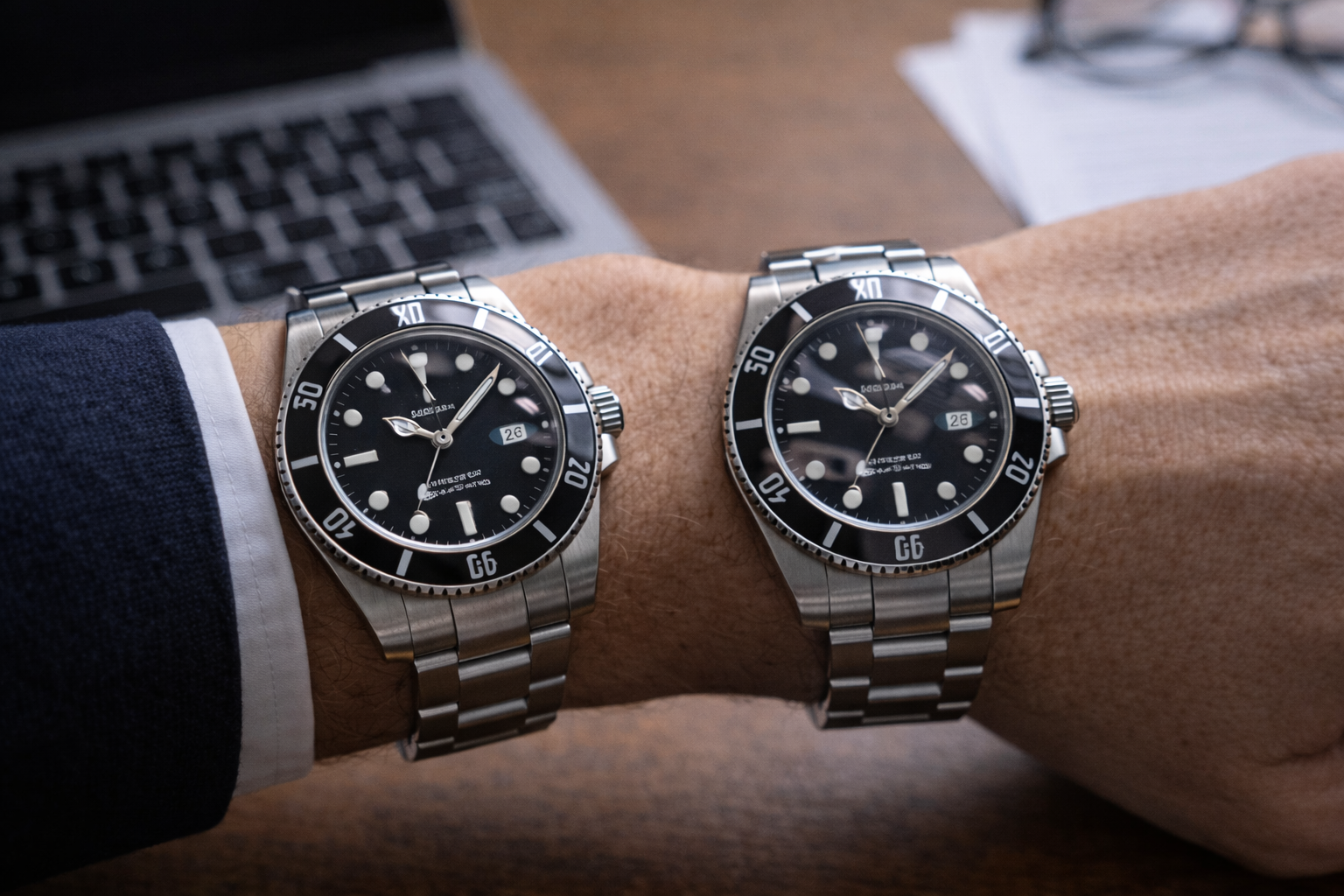
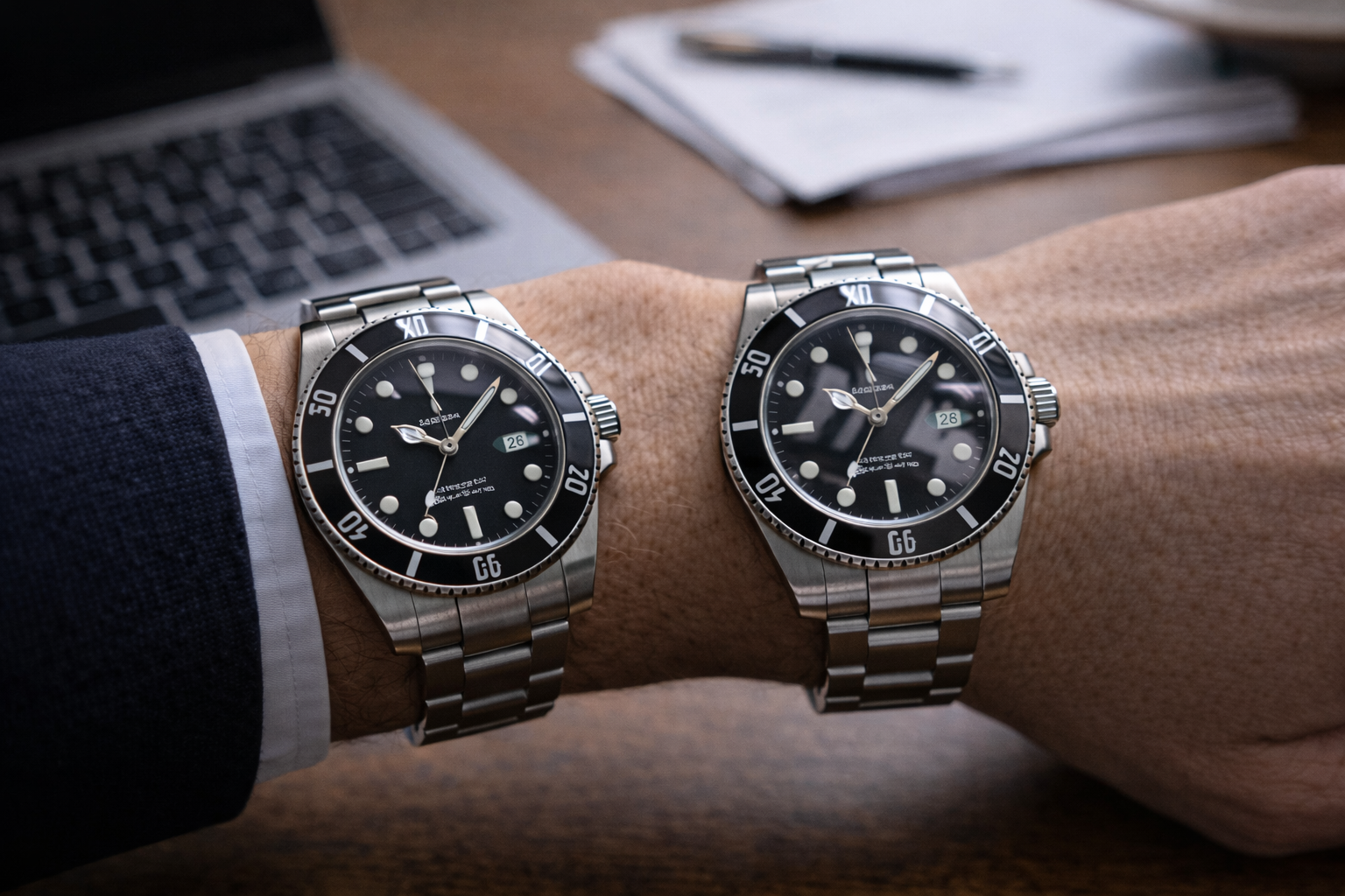
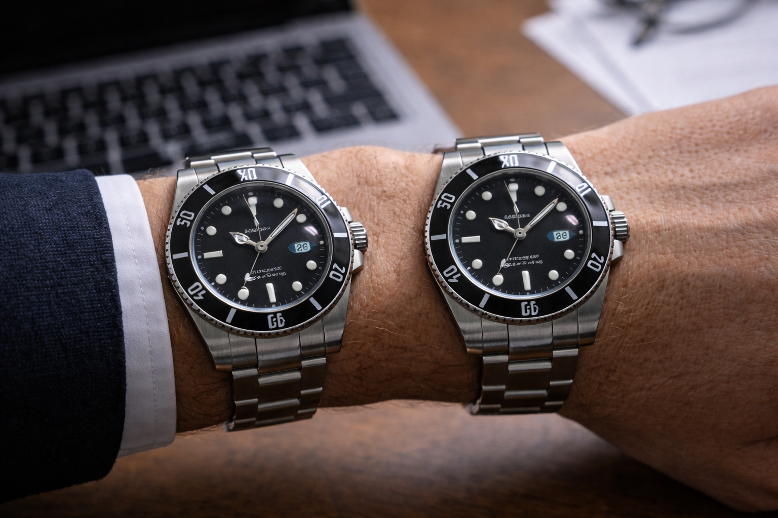
Real-Life Scenario: Desk, Meeting Room, Elevator, and Dinner
Let’s make this practical.
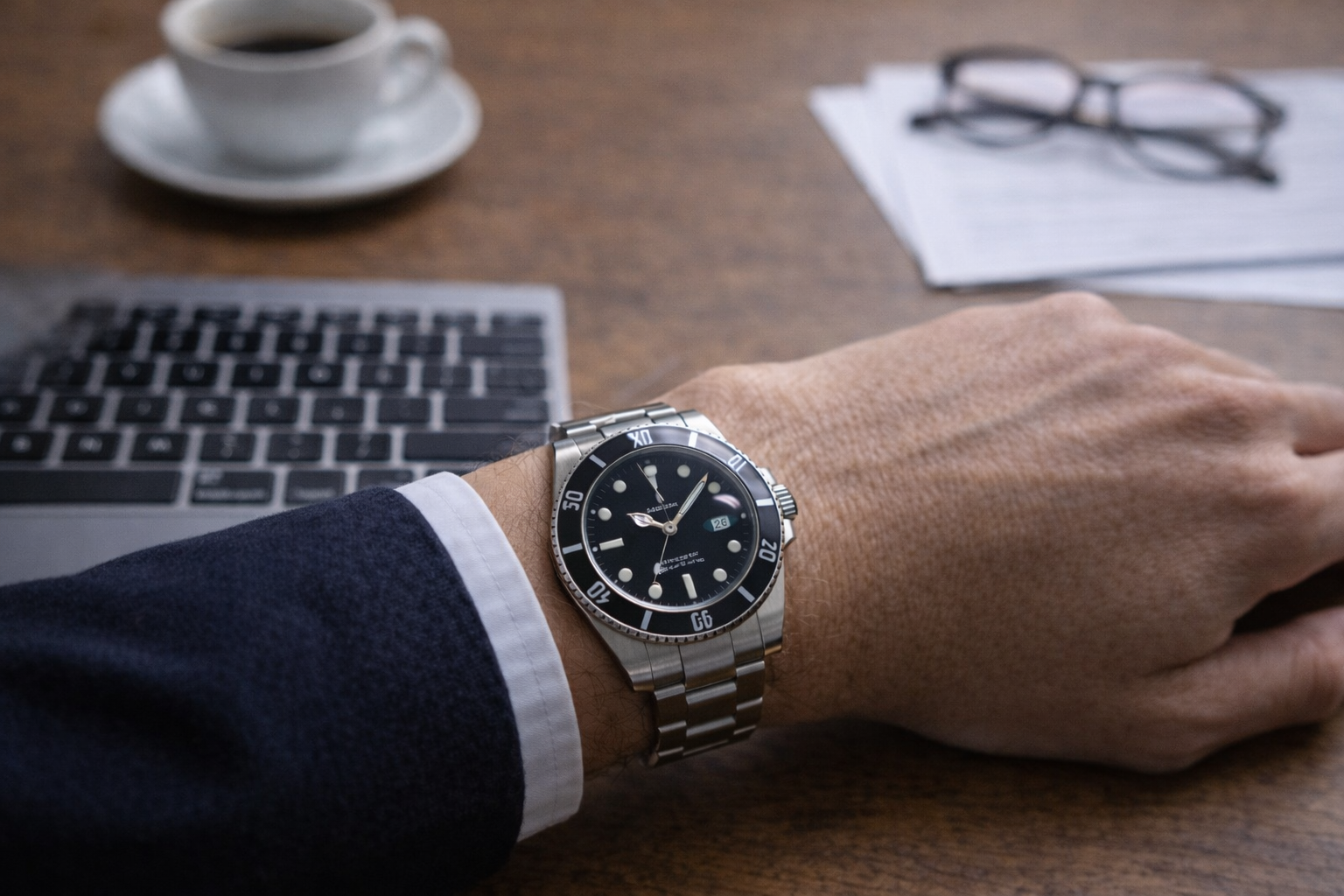
At your desk
This is where the watch lives for many people. You are typing, checking the time, moving your wrist slightly, and seeing the watch mostly from above. Dial calmness and crystal behavior matter a lot here.
In a meeting room
Meeting-room lighting is often flat and unhelpful. A watch that still looks balanced here usually has stronger visual control overall. One that depends too much on better lighting may start looking less convincing.
In an elevator or reflective indoor space
These are quick-glance environments. You do not get time to find the best angle. The watch either looks right immediately, or it does not.
At dinner
Evening lighting can be warm and uneven. This is where a watch’s ability to remain composed really matters. A piece that still feels calm here often leaves a stronger overall impression than one that looked more dramatic earlier in the day.
That is why the best indoor-light watch is often the one that stays consistent, not the one that wins one specific moment.
What Usually Makes One Watch Look Better Indoors?
When one watch looks better than another in indoor conditions, the reason is usually not one single detail. It is usually the result of several things working together:
- calmer dial behavior
- better crystal control
- less visual harshness
- more natural contrast
- more balanced case presence
- more stable overall impression from quick glance distance
That is also why buyers sometimes struggle to explain what they are seeing. They know one watch looks better indoors, but they cannot always point to one obvious flaw in the other.
The problem is usually not one flaw.
It is that one watch holds together better.
How to Judge This More Accurately Before Choosing
If indoor performance matters to you, ask better questions than “Which one looks better in photos?”
Ask:
Does the dial still feel calm in office light?
This is more important than outdoor brightness.
Does the crystal stay out of the way during normal time checks?
A crystal that keeps distracting you weakens everything else.
Does the watch still feel balanced at desk distance?
That is one of the most realistic tests there is.
Does the watch rely too much on one flattering angle?
If yes, indoor life will expose that quickly.
Does the watch keep looking natural during repeated viewing?
That matters more than a strong first impression.
These questions are more useful because they follow the watch into the places where you will actually wear it.
Which Type of Buyer Notices This Most?
You are more likely to notice indoor-light differences if:
- you work in an office
- you spend most of the day indoors
- you check your watch often
- you care about visual calmness
- you are sensitive to reflections and glare
- you prefer watches that feel refined rather than flashy
You may notice it less if:
- you wear the watch only occasionally
- most of your use is outdoors
- you mainly care about broad style
- you judge mostly from photos rather than long wear
That is why indoor-light performance matters especially to buyers who actually want the watch to work as part of everyday life, not just as an occasional photo piece.
The Most Common Mistake in This Comparison
The biggest mistake is assuming that a watch that looks stronger outdoors will also look better indoors.
That is not always true.
In fact, some watches that look slightly more impressive in bright light become less convincing once the environment is less flattering. Meanwhile, other watches that feel a bit calmer outdoors may end up looking much better in real daily conditions.
That is why office lighting is such a useful filter.
It does not reward drama as much.
It rewards balance.
And balance usually ages better.
Final Thought
When comparing Clean and VS, office lighting and indoor conditions often tell you more than buyers expect.
The watch that looks better indoors is usually not the one that depends on perfect angles or dramatic light. It is the one that keeps its composure:
- calmer dial
- cleaner crystal behavior
- better visual balance
- stronger desk-distance impression
- more natural consistency across everyday settings
That is what makes a watch easier to live with.
And for most people, everyday indoor life is where the real comparison happens.
FAQ
Why does office lighting matter so much in a watch comparison?
Because many people wear their watches indoors most of the time, and indoor light reveals dial calmness, crystal behavior, and overall visual balance more honestly than outdoor photos do.
Can a watch look better outdoors but worse indoors?
Yes. Some watches depend more on strong natural light and flattering angles, while others stay more consistent under office and indoor conditions.
What matters most indoors: dial or crystal?
Both matter, but the best result usually comes from how well they work together. A calm dial and controlled crystal reflections usually make the strongest indoor impression.
Why is desk distance such an important test?
Because that is how many people naturally see their watch during the day. It is one of the most realistic ways to judge whether a watch feels balanced and convincing.
What kind of buyer should care most about this comparison?
Anyone who works indoors, checks their watch often, and wants the watch to feel natural and refined in normal daily environments.
How can I judge indoor performance better before choosing?
Look for natural indoor wrist shots, repeated-use impressions, and close-up views under average lighting rather than only relying on bright outdoor photography.
