
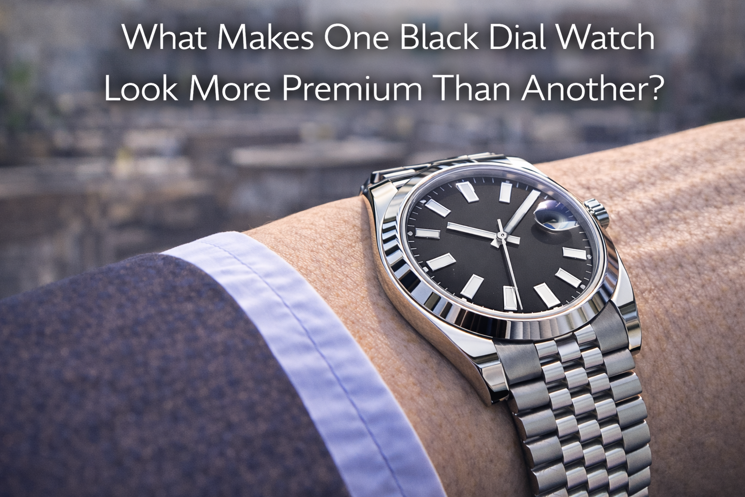
What Makes One Black Dial Watch Look More Premium Than Another?
What Makes One Black Dial Watch Look More Premium Than Another?
At first glance, black dial watches seem simple.
That is part of why so many people buy them.
Black feels safe.
Black feels versatile.
Black usually looks cleaner than brighter colors.
And in photos, two black dial watches can sometimes seem surprisingly close.
But real life changes that impression very quickly.
Once the watch is actually on the wrist — under daylight, in an office, near a window, during commuting, or seen across a table — some black dial watches suddenly feel much more expensive than others. The strange part is that this difference is not always caused by one dramatic feature. It is usually the result of several small details working together.
That is why this question matters: what actually makes one black dial watch look more premium than another?
Because the answer is rarely “the black dial” by itself.
If you have already read our article on does a black dial watch really go with everything or our guide on what makes a watch look expensive, you already know that black is only the starting point. The real difference usually comes from how the whole watch handles light, proportion, texture, and daily wear.
Quick Answer
One black dial watch usually looks more premium than another when it has better dial texture, cleaner crystal performance, stronger case finishing, more controlled bracelet reflections, balanced proportions, and a calmer overall light response. In real life, premium feeling comes less from the black color itself and more from how refined the watch looks once the wrist starts moving.
Why Black Dials Make Comparison Harder at First
Black dials are deceptive.
Because black is visually neutral, it tends to hide some weaknesses in still images. It can make a watch look cleaner, sharper, or more expensive online than it might feel in person. It can also make two watches seem more similar than they really are.
That is why people are often surprised when:
- one black dial watch looks rich and deep
- another looks flat and slightly lifeless
- one feels calm and expensive
- another feels dark but not refined
- one works beautifully in sunlight
- another becomes glare-heavy or visually dull
The black dial is not the whole story. It is more like a base layer. Once real lighting and daily wear come in, the quality of everything around the dial becomes much easier to notice.
1. Dial Texture Is Often the First Real Difference
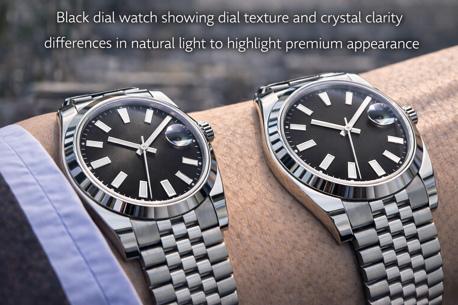
One of the biggest reasons a black dial watch feels premium is texture.
A better black dial usually has more life in it. That does not mean it needs to be dramatic. In fact, the best ones often feel subtle. But when light hits them, they show something extra:
- a soft sunburst effect
- fine matte grain
- controlled depth
- a slightly richer surface
- a cleaner visual transition between dark and reflective areas
A weaker black dial often looks simply black. It may not look bad, but it does not add much.
This becomes obvious in real life when you move from indoor lighting to daylight or when the wrist turns naturally. A stronger dial keeps its character. A weaker one often feels flat or slightly dead.
That is one reason two black dial watches can feel so different even when the layout is similar.
2. Crystal Performance Changes Everything
A black dial can only look as good as the crystal allows it to.
This is a detail many buyers underestimate until they wear the watch outside or under harsher lighting. A weaker crystal often creates more glare, more visual blocking, or a cloudier feel across the dial. A better crystal usually keeps the dial feeling open and easier to read.
That difference matters a lot with black dials because black already absorbs visual information. If the crystal adds too much glare, the whole watch can start feeling closed off.
A stronger crystal usually helps by making the dial feel:
- cleaner at an angle
- easier to read outdoors
- more premium in daylight
- calmer under office lighting
- less dependent on perfect wrist position
This is one of the biggest reasons some black dial watches feel far more expensive in real life than they do in product photos.
3. Marker and Hand Quality Matter More on Black
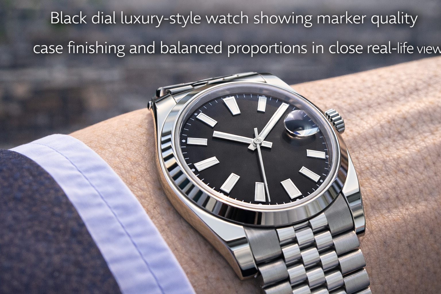
Black dials create strong contrast, which means the hands and markers become more visible.
That sounds like a good thing, and it usually is. But it also means weaker details are easier to notice.
A more premium black dial watch usually has:
- markers that feel crisp and proportional
- hands that stand out cleanly
- polished surfaces that catch light in a controlled way
- enough contrast without visual harshness
- a layout that looks complete at a glance
A weaker one may have markers or hands that technically do the same job, but feel slightly less resolved once light hits them.
This is why premium feeling is not only about dial texture. It is also about the quality of the elements placed on top of the dial.
4. Case Finishing Decides Whether the Watch Feels Cheap or Controlled
A black dial can make a watch look sharper, but that sharpness quickly exposes the case.
If the case finishing is strong, the whole watch feels more expensive. If the case finishing is weak, the black dial can actually make the difference easier to notice.
This is especially visible on:
- polished bezel edges
- brushed upper lugs
- case side transitions
- the area where the bezel meets the crystal
- watches with strong contrast between polished and brushed surfaces
A better-finished case usually looks:
- more settled in light
- cleaner in shape
- sharper without being harsh
- more confident on the wrist
A weaker one may still look fine in soft light, but outdoors or under office light it can feel flatter, brighter in the wrong way, or less precise.
This is one reason black dial watches often reward close real-life viewing more than photos.
5. Bracelet Quality Changes the Premium Feel Faster Than Most Buyers Expect
A lot of people compare black dial watches by looking only at the dial and bezel.
In real life, the bracelet often changes the whole impression faster.
Because the bracelet moves constantly, it keeps catching light across the wrist. That means its finishing, flexibility, and visual rhythm have a big effect on whether the watch feels refined.
A better bracelet usually feels:
- smoother in motion
- more fluid on the wrist
- more coherent with the case
- less noisy in reflection
- more expensive without trying too hard
A weaker bracelet often makes the whole watch feel more ordinary, even if the dial itself is attractive.
This is especially true with black dials because the bracelet becomes the brighter visual counterpoint. If that counterpoint is too harsh or too flat, the watch loses some of its premium balance.
6. Proportion Matters More Than People Think
A black dial watch can still look less premium if the proportions are off.
This includes:
- case diameter
- bezel width
- dial opening
- thickness
- lug-to-lug balance
- bracelet width compared with the case
A premium black dial watch usually feels visually settled. Nothing seems too open, too tall, too wide, or too compressed.
This matters because black dials can make the watch feel more solid and more serious. If the rest of the proportions are not balanced, the watch may start feeling too dense or too heavy in mood.
That is exactly why a good guide to choosing the right watch size matters even when the question seems to be about dial quality. Premium feeling is rarely just about one component.
7. Light Response Is the Real Test
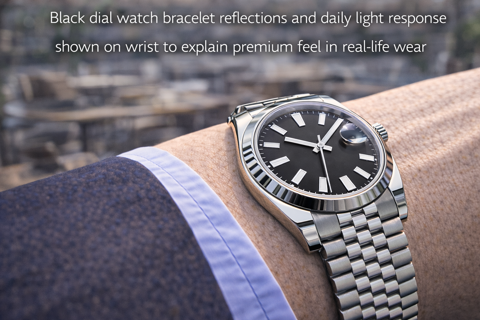
If there is one idea that ties this topic together, it is light response.
A better black dial watch usually behaves more gracefully in changing conditions.
It stays balanced when you move from:
- office light
- daylight
- near-window light
- outdoor walking
- café lighting
- quick glances during commuting
What does that mean in practice?
It means:
- the dial keeps some depth
- the crystal does not kill readability
- the markers still feel clean
- the case reflections stay controlled
- the bracelet does not turn into visual noise
That overall behavior is often what people really mean when they say one watch feels “more premium.” It is not one magic detail. It is the watch remaining composed in real life.
8. Simplicity Can Make a Black Dial Look More Expensive
This is another detail buyers often misunderstand.
They assume a more premium watch should always have more going on. Sometimes the opposite is true.
A black dial often looks more expensive when the design stays clean:
- fewer unnecessary details
- strong negative space
- restrained text
- simple marker shapes
- a date window that does not break the dial awkwardly
- a handset that feels proportionate
That is why some black dial watches feel more luxurious even though they appear simpler. The restraint creates confidence.
This is very similar to what we discussed in why some Rolex-style watches look more understated than others. Understatement often feels more premium because nothing is trying too hard.
9. What Buyers Usually Notice in Real Life
In real life, people rarely say:
“This black dial has better texture and superior light behavior.”
What they actually notice is:
- this one looks richer
- this one feels sharper
- this one seems more expensive
- this one stays cleaner in the light
- this one just looks more finished
That is the real answer.
The premium difference is often being felt as a whole impression, not analyzed piece by piece. But the reason that impression exists is that several details are working together properly.
What Buyers Usually Get Wrong
A lot of buyers assume:
- black automatically looks premium
- darker always means more expensive
- any clean black dial will look good enough
- the dial color matters more than finishing
- the difference is mostly branding
In practice, that is not how it works.
A black dial helps because it is versatile and visually strong. But if the crystal, case, markers, bracelet, and proportions are not supporting it properly, the watch will only look “fine,” not truly premium.
That is why some black dial watches become favorites, while others never feel as good as buyers expected.
How to Judge This More Realistically
If you want to understand why one black dial watch feels more premium than another, ask practical questions:
1. Does the dial gain depth in real light?
Or does it stay flat?
2. Does the crystal help the dial or block it?
This matters more than most buyers think.
3. Do the hands and markers feel clean at a glance?
A premium watch usually reads well immediately.
4. Does the bracelet support the watch or distract from it?
Movement reveals this quickly.
5. Does the whole watch stay composed in different environments?
That is often the best real-life test.
This is also why how to choose the right watch for everyday wear stays relevant even in a topic like this. Premium feeling is easiest to judge when the watch is actually part of daily life.
Final Thoughts
What makes one black dial watch look more premium than another is not the black dial alone.
It is the way the dial texture, crystal, markers, case finishing, bracelet quality, and overall proportions work together once the watch is actually worn. In real life, the best black dial watches usually feel richer, calmer, and more refined because they handle light and movement more gracefully.
That is why two black dial watches can look close in photos and still feel very far apart on the wrist.
And most of the time, you notice that difference faster than you expect.
FAQ
Why do some black dial watches look more expensive than others?
Usually because of better dial texture, crystal clarity, case finishing, marker quality, bracelet behavior, and more balanced proportions.
Does black automatically make a watch look premium?
No. Black helps, but it does not replace good finishing and strong overall design.
What is the biggest difference in real life?
Often crystal performance and how the dial responds to light. These change the impression very quickly.
Does bracelet quality matter that much on a black dial watch?
Yes. The bracelet becomes the brighter part of the watch and can strongly affect whether the whole piece feels refined.
Do simpler black dial watches sometimes look more premium?
Yes. Clean, restrained designs often feel more expensive because they look more controlled and less forced.
